-
-
NestWorth: Helping Moms Save
-
One Saving Tip Per Day - Delivered Via Widget
-
Go Premium For More Features
-
Let Us Make Saving Easy


NestWorth
Inspiration
I built NestWorth because I watched my mom carry the weight of everything — raising kids, managing a household, and quietly stressing about finances. Money wasn’t just about numbers; it was mental load.
As I got older, I realized how overwhelming financial advice can feel — especially for busy moms. There are budgeting apps, investing apps, grocery apps… the app bloat is real. I didn’t want to create another app that demanded attention.
So I asked a simple question:
What if saving money didn’t require opening an app at all?
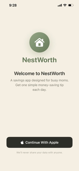
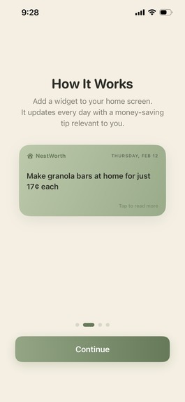
That’s why NestWorth lives as a widget.
What it Does
NestWorth delivers one practical, realistic money-saving tip per day directly to a mom’s lock screen.
No scrolling.
No spreadsheets.
No overwhelm.
Just one small action per day.
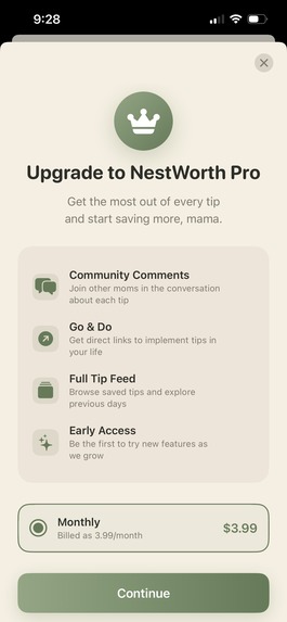
The premium version unlocks:
- A full archive of past tips
- Category filtering
- Community discussion
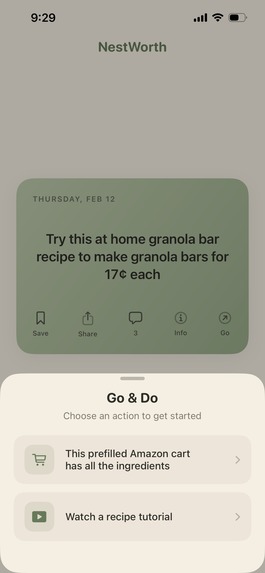
- One-tap “Interact” tools that make implementing tips frictionless
The philosophy is simple:
$$ \text{Small daily actions} \rightarrow \text{Long-term financial confidence} $$
How We Built It
NestWorth was built using SwiftUI and WidgetKit, with development accelerated using Cursor.
The entire app was designed as an MVP optimized for clarity, speed, and habit formation. I focused heavily on:
- Native iOS design patterns
- Smooth animations and haptics
- Clean state management
- RevenueCat for subscription infrastructure
This stack allowed me to move quickly while maintaining high UI polish.
Challenges We Ran Into
One of the biggest challenges was cohesion.
Saving money on groceries and investing in IRAs can feel like two completely different worlds. One is tactical and short-term. The other is strategic and long-term.
The question became:
How do you unify practical savings advice with financial growth advice without it feeling scattered?
The solution was reframing everything around daily action.
Whether it's:
- Making $1 freezer burritos
- Switching to LED bulbs
- Increasing an IRA contribution
They all ladder up to the same idea:
$$ \text{Tiny actions} \times \text{Consistency} = \text{Compounding impact} $$
Once I centered the product around compounding behavior, everything felt cohesive.
Accomplishments That We're Proud Of
- A polished, calming UI with thoughtful spacing and animations
- A lock screen widget that truly reduces friction
- A monetization strategy aligned with real value
- A clear product identity focused on habit formation
The soft color palette and subtle haptics make the experience feel calm — which is important when talking about money.
What We Learned
This project sharpened my understanding of:
- UI/UX hierarchy
- Habit-driven product design
- Emotional storytelling in utility apps
- Shipping efficiently under time constraints
- Structuring monetization early instead of bolting it on later
Most importantly, I learned that reducing cognitive load is often more powerful than adding features.
What’s Next for NestWorth
This is just the MVP.
Next steps include:
- Customizable widgets
- Smarter personalization
- Creator partnerships featuring real moms’ blogs and content
- Affiliate integrations through the “Interact” button
- Expanded settings and user controls
- Integrations with grocery, investing, and budgeting platforms
Ultimately, I want to see real moms use NestWorth and feel one small win each day.
Because when moms feel financially confident, families feel it too.

Log in or sign up for Devpost to join the conversation.